
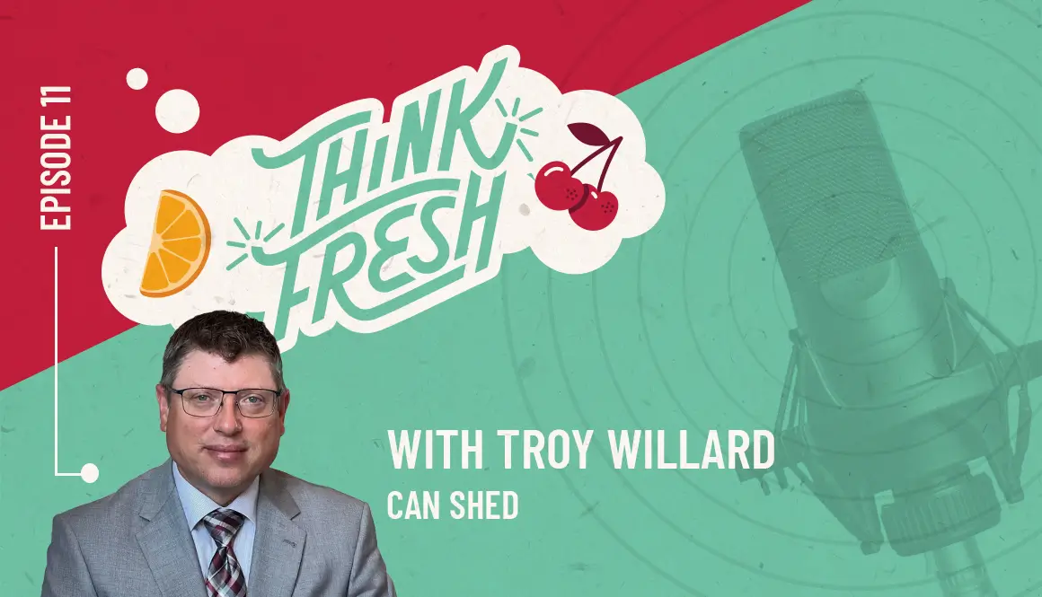
Full Transcript of Think Fresh - Episode 11
We’re doing this. All right. Hello and welcome to this where you’re talking. Oh, my God. All right, we’ll try this again. Ryan, are you settled? That’ll do. Okay.
Hello, and welcome to Think Fresh, a podcast brought to you by de Novo Marketing collective Creative. Coming to you from our Ideas Institute and here to talk about all things marketing. Insights on new trends, innovative ideas and marketing tools you can use in your day to day life and whatever else we deem relevant. I’m Jen Neumann, de Novo CEO and your host, and I’m Ryan Shenefelt, account manager, innovation and education lead and resident nosy eavesdropper, always looking to push the envelope.
He is indeed very, very nosy. Today we’re going to talk about rebranding and confronting the age of average. Today we’re changing things up a little bit. Jen is is off the mic. Today we are joined by Chad, our copywriter and messaging strategist. Chad, welcome to another episode of Think Fresh. This is your your second. This is my second time.
Yes. I’m glad to be back. Nice. Well, why did we cover your first. We was all messaging. Okay. Messaging matters. So if anyone wants to go back in the archives and find that episode perfect. So similar, similar vein. Today, talking about rebranding and we are joined by, de novo client, Troy Willard, who is the owner and CEO of Can Shed.
Troy, welcome to the pod. Hello. Thanks for having me. Yes, yes. Of course. Troy, before we before we get into it, how long is Can Shed been around? We are approaching our 28th year, 28 years. That is amazing. That is. We’ll go into that a little bit deeper. But 28 years of of redemption. That is awesome. I know that, everyone on the podcast has heard Ryan’s sports journey.
But if you listen to our Messaging Matters podcast, you know that Chad is actually the voice of the Rough Riders, right? But, Troy, you also have a connection to hockey, right? Oh, yes. Hockey’s near and dear to my heart. And do you play or are you just a fan? I’m a fan. First. I also play,
Or attempt to play. So have you, have you run into Chad at the Roughriders, right? Oh, yeah. That voice is recognizable. Yeah. And I’m running around all the time, so it’s hard not to see me. I’m there. Yeah, it’s it’s true. And on the opposite side of Troy, where I’ve never actually played hockey at all. I laced up skates maybe five times in my entire life.
00;02;34;15 – 00;02;52;02
Unknown
So I’m more about walking around on things that don’t involve the ice for the most part, and walking on the ice is actually possible, which still confuses me. I don’t whenever I’m near the ice, I’m I’m slipping. So, I always in aww, when people are not falling on there, but on the ice, you don’t want to be the first one on there after the Zamboni.
00;02;52;04 – 00;03;09;06
Unknown
No, I was just that was Ryan’s big revelation from the previous podcast that I was on. As I said, well, when we go out after they’ve played, they’ve cut up the ice to such an extent that it is almost like asphalt. Now, when the Zamboni comes through, then no go. That’s that’s when things get slick. So it was another sports revelation for Ryan last time around.
It’s like, wait, what? It’s actually cutting off like the top layer. Like smoothing it out. And so I did not did not get that. But Trey you you play and then also your do your kids play or did they are they are they ice skaters. Yeah. So actually, we lived very close to the ice arena when it was first built.
So, I’ve got my oldest daughter was a figure skater, pretty well accomplished there. And then my son played hockey, ever since he was about seven years old. So. And that’s what got me interested. And I didn’t play as a kid or anything like that. It was just like we were spending every single day, almost every hour down at the ice arena.
I’m like, I might as well have fun while I’m here. Heck yeah. So you were there, like taking your kids to practices and you’re like, well, I can do this. And you joined the league, right? Yeah, exactly. Yeah. It’s just a rec league, you know, in the beginning was a bunch of dads and we didn’t look very good at all.
But, you know, over time picked up a little a couple things.
All right friends let’s let’s jump into into our topic. So we know today that we’re covering rebranding kind of coining that confronting the Age of Average, Chad I am going to have you talk a little bit more about this to kick us off. Just because this is this is something you are passionate about.
Three things happened, and it was serendipitous because it was all within a short amount of time. One was this article that came out last March or almost a year removed from it, and the title of the article is Age of Average. And what this individual did is he did a study and looked at all these different facets of life.
So he looked at buildings, building design and architecture. He looked at interior design, he looked at car manufacturing, and then he looked at brands and logos. And what he found is when you put those on a grid, it’s very hard to see the difference in any of those. When it comes to cars. Were past the days of the big fins on the back of the rides and the styling and the angles.
Now a lot of these cars start to look the same. The color patterns are pretty much the same. The styling is the same. It’s tough to differentiate a Toyota from a Ford in many cases now, so that’s one aspect of it. And then look at the building design, apartment complexes, condo complexes, they all start to have that same vibe to them, right?
They look the same look at logos. And the part of this is that it’s all clean and modern design, which has become really trendy in the last 10 to 15 years. The problem is that things start to all look the same. And the anecdotal side of that is another colleague of mine, Julian and I had the opportunity a couple of months ago to speak to several classes of kids, and we were talking mostly about marketing as a whole.
But what it served is almost like a focus group. One of the slides that I had up side by side were of the jerseys, two different jerseys from the Toronto Raptors basketball team in the NBA when one one jersey, one image, if you will, on the left side was their current jersey. That’s what they used today. It has maybe two design elements to it.
It’s very plain. It’s tough to distinguish. It looks the same other than their name Raptors. The other jersey that was on the right hand side of the screen was their initial jersey that they had when they first started in 1995. I think it was loud, obnoxious, some might even say it has a literal raptor on the jersey. And I asked the kids I said, okay, look at these jerseys side by side.
Which one do you prefer? Which one do you like? We probably talked to 30 kids at the end of the day. At the end of these presentations, 90% of that 30 loved their first jersey. The one that was loud, the one that was heavily branded, the one that was original, really out there. And so what that told me is that even though a lot of marketing is turning toward this kind of modern, clean style, that’s not what their audience wants.
Their audience likes stuff that’s original stuff that’s vibrant stuff that has personality. And so then the final piece of this puzzle is the work that we’re doing with Can Shed, which is the opposite. If I’m thinking about can Shed, I’m thinking more about that first Raptors design, that 1995, because it speaks to their brand, it speaks to who they are.
And that was a perfect dovetail into the work that we were doing at Can Shed. And I would be honest, as I was talking to these kids, even though we were talking about an example from the NBA, I thought, there are some real tangents here to the work that we’re doing with a brand like Can Shed, because that’s what the design there are.
There are parallels there, if you will. And a lot of times when you are rebranding or looking at another brand, you pull up competitors, you pull up other people within a similar industry. When you are branding someone. And that’s where that conformity creeps in because you’re like, oh, well, I’m comparing to this, I’m bringing in this. But then everything starts to look the same.
And really the only place that you have room to be creative is, is with your colors and you and your messaging. Today, we know that your brand is more than just your logo in your color palette, but that’s really what we’re going to be focusing on a lot today. The colors, the the the look and feel, because we talked about messaging already on on the pod.
But Troy, I’m curious in in your space in the container redemption space, were you trying to break outside of of any molds or were you trying to change it up when you, when you started the rebranding process? The original logo was a can in a shed was that there’s not there’s not much creativity to that in. And we just felt like there’s so much more about recycling in general and specifically redemption that we could speak to a lot better through images with, with a new brand.
Troy, tell us a little bit more about Can Shed. What is the what is the purpose? Some of our listeners might not know what container redemption is. Just give a a brief rundown on on the kind of the background and the impact of Can Shed. Yeah. So can shed is a kind of a specialized recycling company, that specifically targets redeeming beverage containers where the middleman of all that.
So we’re we’re the we’re the business between the consumer and the distributors. We’ve been doing that for 28 years. We do a lot of work in that, field. Not just dealing with customers walking in and redeeming their containers, but also business to business relationships. We go out in the market, we pick that up from bars and restaurants.
Any retailers that are still redeeming? We work with our distributors to go pick up other businesses like ours to kind of consolidate all the material into one spot. So it’s making sure that it’s getting back, back to market and being reused again. You know, our stretch or our influence is all over eastern Iowa. You know, we do some stuff here more locally in the Cedar Rapids, Iowa City areas, but we also get into Davenport and Dubuque and other parts of the state, bringing bringing material back.
What started your you down the path of container redemption? Well, I used to drive for a beverage company. I used to deliver beverage containers and into stores and convenience stores. I was told that I need to start picking up my stuff, because one of the companies that was doing that work in town was getting out of it. I thought it was going to be somewhat of a little bit of a side hustle for me.
You know, I knew pop cans, I could get the stuff sorted, maybe something I could do on the weekends in my garage. And the more I started asking questions and talking to people, I found that there was a bigger opportunity there. I threw in with a guy, after a three hour meeting in a Perkins, and, we decided to go into business together, and it’s it’s been, you know, the school of hard knocks, a lot of a a large learning curve.
We found out that there was a lot more need out there for container recycling than I could ever have imagined. So 28 years, roughly how many cans are you up to? How many cans be processed in those 28 years? Or sorry, redeemable containers. Also plastic bottles and glass bottles. Yeah, yeah. Oh boy. I the last time I looked at the counter we were well over 3 million or 3 billion.
Excuse me. Billion, 3 billion cans. That is that is wild. If you were to stack 3 billion cans on top of each other, that’s averaging about 4.8” per can. The stack would be over 228 million miles, which will get you from Earth to Mars. That’s only the Can Shed. So there’s there’s about close to probably just shy of 2 billion containers annually sold in Iowa.
And when you look at the size of Iowa, you know, like from a demographic population, state, that’s not very much. Look at what you know, what a state like California in New York probably consumes annually. So 2 billion containers sold in the state of Iowa per year. We’ve redeemed, Can Shed has redeemed 3,000,000,000 in 28 years. That means there’s room to keep going.
So Iowa, we can do better. We can redeem more containers, especially at Can Shed. What are your I briefly mentioned it. What are some of your different options for redeeming Troy as far as a consumer goes? We’ve we’ve really kind of set our presence in the market by doing bulk redemption. You know, there’s a there’s a box that you can buy from us as a liner that goes into it.
The volume of that box based on the the size and type of material you’re putting in the bag, determines how many quantity is in that bag, and we pay a nickel times that quantity. The best way to explain that is if if you, you have 12-ounce cans, 240 per container, you get $12. One thing, you know, you, you know, come to the Can Shed with a $12 bag, you’re going to walk out with a fresh bag and a ten and a $2 bill.
So everybody says, where’d you get that $2 bill? Everybody talks about the Can Shed. Probably the single most important marketing, strategy we have is that $2 bill. And then here within, about the last year or so, we’ve got Bottle Drop Iowa, which is kind of a new feature that we’ve got. It’s an app based program, smaller size bags, kitchen sized garbage sack that you can put your cans and plastic bottles into a you tether that, bag with a unique QR code to your to your app, to your phone, and then you just drop it off with a that can be outside of our, our open hours, a little more convenient
that way. And you just walk up to the door, unlock the door with your phone, drop off the bag and walk away and wait for the funds to hit your hit your account here, within ten days. And then that way, you know, you can do a digital transfer of that, have that go to your bank account or use a pay app like Venmo or PayPal to to get your funds.
Troy, you mentioned kind of the rebranding and talking about, some of the things that are inside on the walls, right. de Novo started working with Can Shed about a year and a half ago in mid 2023 on on the rebranding process. And, and part of that was determining what was most important to to you and your team.
You had mentioned the the can and the shed, but since has evolved so, so much beyond the shed. So one of our iterations of the logo, it did have the shed. And then we realized we’re bigger than the shed. Now our new buildings are not in sheds. We are also in, in containers were in bags all throughout eastern Iowa.
We we did discontinue the shed. However, it does still remain true in some of your some of your old materials that you’ve got inside that almost an archive. But I wanted to to talk about the purpose of having those redeemable containers right up and in, in center. Because previously it was really focused on the can.
Yeah, I guess probably not marketing 101 to, to call it Can Shed when you’re handling, you know, all types of beverage containers, whether it be glass, plastic or aluminum. And so that’s, you know, we we get that question a lot, believe it or not, I didn’t feel like we could completely abandon Can Shed and come up with something more inclusive. But we certainly wanted to represent that in our new logo that we we handle all three materials.
We’re able to put that element of circularity into it with the chasing arrows, kind of like, you know, tying us to to recycling some of the more known recycling elements that are out there. And so I think you guys did a really good job getting through all of that. And coming up with something that looks modern, looks environmental, conveys the message that we’re there to handle all the beverage containers and the person who isn’t in the room who had such a big hand in this was our multimedia specialist and designer Jav.
He really put this together. And I always think about real world examples of branding come to life and what the differentiator is. And to bring this maybe full circle again, I’m just thinking about the Rough Riders and we did this recent intermission activity with containers for a cause, right? And out on the ice, we had the bins that are used for containers for a cause, and they’re bright green.
They’re neon green. They stand out. They have that Containers for a Cause and Can Shed branding on them. And with all due respect to some of the other intermission contests we have, very rarely do we get something that vibrant. And so when you see three bins like that out on the ice, it’s kind of the it’s the brand come to life, if you will.
And there was just a general atmosphere that people’s eyes tend to gravitate right toward those bins because of the branding. And so even for someone who isn’t as innately knowledgeable of design and color elements and palettes and whatnot, when you see it out in the real world, it does tend to just humanize it. It brings it back down to brass tax, and you realize that the colors and the vibrancy and the fact that this is not a brand, it’s just derivative.
And it is in an Age of Average that does stand out. And when I looked around, I took about like a 5 or 10 second beat to look around the crowd that night. And people’s eyes tend to gravitate towards something that stands out. It’s colorful and vibrant, so I love when something like that. Branding. We tend to talk about it in this nebulous function from time to time, but it has a real pragmatic, actual application.
When it’s out in the real world, people notice it, and we’ve used that stuff with the the containers that we want to put out there and the graphics for the bottle drop doors and all that. It’s starting to make its way onto our trucks and our some of our billboard advertising all that. And everybody always mentions the fact that it’s really cool, right?
And that’s that’s what we like. We want it to be fun. We want it to be cool, you know, trying to to try and again to get people excited about it in, in a small way. And what we were able to do with, the initial logo, it’s a three color logo. So you’ve got your, you’ve got your plastic bottle, your aluminum can as well as your glass bottle.
And with those three colors, we actually were able to create a, a color coding system. Oh, so you’ve got green for plastic, that gray or that slate for aluminum and that blue, that water blue for glass. And the color palette is derived from, from nature. Right. We’ve got the the grass green, the slate gray. I’m kind of like a stone or aluminum color.
And then your, your ocean blue. But then on top of that, I think Jav really wanted to have some fun. And like he, he met with you and Isaac and Julie and your team and really wanted to add some color into this. So adding in our secondary color palette still kind of geared around, around nature, that terracotta orange, a sky blue and that bright green color as well really lend to an eye catching look and feel.
But still something that nods back to nature. And keeping things clean and green. Troy, I’m interested. From your standpoint, this is a very bright color palette, and especially with the rebrand, there are certain clients that we would come to with this color palette, and I think they would have a visceral reaction to it. They might say, no, we don’t want to go that route.
What in your mind, why would you embrace a color palette like this? This is very vibrant, especially when we think of container, redemption, misperceptions, conceptions around it. What what gravitated toward this color palette, the primary colors, they’re very representative of of our business, our our position, you know, from Tanner’s we handle and being part of the environment right.
And and the rest of it is just it all just it works. I mean, it’s the cascading bottles, the the the fun graphics, the, we always joke we need more terracotta. I mean, it’s it’s fun to say terracotta. It really makes everything else pop, that much more. It’s eye catching, you know, people are going to see it and they’re going to look at it and there’s there’s part of being eye catching to be eye catching.
But when there’s that purpose and there’s that intent behind it, which I think carved did a phenomenal job at really digging into your brand, in your in your company and finding those colors that still are eye catching. But it’s not like you have a hot pink background with a lime green font, like I would do in MS paint when I was eight.
It’s still eye catching, but there’s purpose behind that. Well, and you know, we we talked about how, you know, those those primary colors, the greens and the blues are the safe ones. You see a lot of logos done that way. So in that, you know, we’re kind of like the sheep there, but the secondary colors create that space or that differentiation for us that hopefully we don’t blend in with the rest.
And we’ve tried to align the messaging with that vibrancy as well. Right. If there’s a disconnect between the graphics and the messaging, then that’s a friction point for the audience. So for instance, even something like the bottle drop, I will program what’s a very succinct way to say that, in a way that’s also fun and at the same time literally explains the process.
So stop, drop and profit. I think everyone can probably think of the song that was the inspiration for that, but just taking that and turning odds ahead a little bit makes it fun. It tells them the literal process of what they need to do, but also it aligns so well when you see it visually with the graphics and the color pattern too.
And Troy, you and your team had recently gone to a recycling conference, right? Yes. Can you talk a little bit about how, you you almost unveiled the brand at the recycling conference and how how that went for you guys? Yeah. So the, you know, the State Recycling association, always has an annual conference and we’ve never been with it, always attended, but never been an exhibitor there before.
And you know, now we have these 20ft, containers, shipping containers that we can use retrofit with the bottle drop program. We can set these in places. In public places, for people to, to utilize those instead of trying to find one of our brick and mortar locations. And we were pretty excited about it. We we got one of these containers put together.
We got graphics wrap, you know, wrap the thing in the graphics. And we happened to to by chance, just end up being in the center of the exhibit hall for, for this conference, which there’s probably 40 exhibitors there, whatnot. And, and we’re right smack dab in there and all eyes when they walked into that exhibit hall, got to see the Can Shed head container there.
The bottle drop container. And we literally had three people there for two and a half days that talked constantly to somebody that wanted to know what we were doing. How does the program work? How how can they buy these, how they can they bring them to their communities and get it done? So it couldn’t have been a better never doing a, an exhibit before of any sort that was like, the biggest confirmation we could get that we’re on the right track with this stuff.
Yeah. Talking about the the Age of Average or just that conformity. When you’re at a trade show, you want to stand out and everyone there is trying to stand out there trying to capture those individuals. And we were we were glad to be able to help you do that. But also, like you said, it’s your team being there, being excited, and we hope that your team is feeding off the energy of the designs.
Right. It’s it’s very hard to be to be grumpy when you’ve got this bright green, this terracotta, this, this lime color just kind of surrounding you. You’re, you’re feeding off of the brand. And in the world of social media as well, very, very similar. You can’t stand out just to stand out. You have to have meaning behind that.
And I think that that with a brand that has some fun and some character behind it, more personality behind the brand gets you closer to the the jersey with a Raptor on the front of it versus just the jersey that has the typeface that says Raptors. And how many times do people equate container redemption with fun? Maybe they should on a more regular basis.
But the great thing is, with Can Shed, they’re starting to when they see cans and they see this new branding, they relate container redemption to something that’s fun, beneficial for the environment. And also there’s a financial incentive for them. That’s it’s really kind of the three bases, if you will. Troy, how has the reaction been to the, the rebrand or the new logo and color palette with with your friends, with your coworkers and with people that are coming in or that you just see in the community?
I think, you know, it’s been very well received. Everybody comments on it. You know, we are in a situation where, back in 2022, when they changed the law, they they increased the fees that we get paid from the distributors, which was long overdue. And but they also allowed retail sites to get out of the business. So, you know, you don’t see where you take containers back to the grocery store or the convenience store anymore because they wanted to bolster redemption centers and get more redemption centers out in the public to be the the focal point of returns.
And we we’ve always been a leader in technology ideas. How can we make this better. And so with with the additional revenue we are getting, you know, we we for the very first time ever had an opportunity to do marketing and, you know, work on these things like a normal business would. And, you know, we were lucky enough to, find de Novo there.
And, you know, we’ve been able to do so much good because it’s been the rebranding, it’s been the website, it’s been social media, it’s been, other types of media. It’s been opportunities to do, the containers for our cause events at the Rough Riders games. And, you know, we’re in we’re I’ve really still at the tip of the iceberg, right?
We’ve got new facilities opening up. More, more opportunity to keep building that brand, into more communities. So we’re looking forward to that. Yeah, lots of things coming for for Can Shed. Troy, if you could leave people with one thing or one request, what would that be? Please take the time to redeem your containers. It is the best opportunity you have to make sure you’re you’re doing what you can for recycling.
Certainly. It’s it’s money back in your pocket that you’ve, you’ve paid for when you’ve bought the, bought the beverages. And even if that’s not important to you, we can do a lot of good with it. Troy, thank you so much for being here today. Sharing about Can Shed about your journey and and just for your time this morning, thank you for having me and and for everyone listening.
Be sure to check out the show notes of of this section for our visual rundown of everything that we talked about, from Raptors jerseys to that Can Shed, rebrand and and so much more. So be sure to check out those show notes. Now it’s time for creative briefs! In this segment we take a look at some existing marketing, sometimes done by de Novo, usually done by others.
And we we dig in, we evaluate it, we analyze it, and, and we just chat through some, some trending things that are happening in, in the marketing space. Today, we’re going to be looking at a new Kellogg’s campaign that is announcing their their rebrand. And I think this one started in, in Europe and is branching out as they as they expand.
Chad, talk a little bit more about about this one. So if the theme of this show is about the power of rebranding and not being afraid to go bold, Kellogg’s is a really good example of that. Now I’ll be upfront. I love this campaign and I was surprised after it dropped after it came out as I was scrolling through LinkedIn.
The reviews for this, the feelings about this were much more polarized than I would have thought. So the Kellogg’s we know Kellogg’s is their traditional breakfast cereal. It’s a go to they it’s a little bland in terms of the cereal itself, but it is the original. When you think of breakfast cereals and so what happened is they’ve been around for a long time, but they needed to reclaim some market share because they had taken a lot of hits over the years.
And so what they did is they played into a few things. One was they played into the mascot, the rooster itself, which before this campaign, I did not know that he had a name at all. But he is Cornelius and he is their rooster. And he is their mascot, for lack of a better term. So they really played that up.
But also what they did, which I thought was the most creative aspect of it, is that they took Kellogg’s in. They isolated. These were in billboard ads and digital advertising. They isolated just two letters of Kellogg’s, and it was OG, and they put Cornelius right in there with just OG. And then the tagline, which was “See you in the Morning”.
And what they were doing, conveying pretty explicitly and pretty out there, and in a bold way, is that we are the original breakfast cereal. And if you’ve forgotten about us, maybe it’s time to revisit that. And there are a lot of imposters. There are a lot of derivatives, right? People that kind of look like us. Other breakfast cereals.
It’s a crowded market, but we are the originator, the OG, if you will, and being able to take that because it’s naturally part of their name is just such a natural way to convey their brand. I love the whole idea of that, that campaign, what that says immediately. It also speaks to an entirely different audience. Before we were even talking about this, we were looking at the one minute ad that they put together, which is basically, if you can envision it in your mind right now as we’re talking, I’m sure we’ll post the video as well.
But it’s a larger than life rooster. Let’s say a Jurassic Park sized rooster walking the streets of a city and boldly proclaiming, boldly shaking its tail feather and whatnot. And really, if you think about it, kind of staking its claim for Kellogg’s as a cereal, Kellogg’s as a brand, it’s a very modern way of doing it, but not necessarily in the modern way.
We were talking about where things are bland and they tend to look all the same. This is a very bold statement, especially from a brand like Kellogg’s, where it’s also unexpected. Yeah. And and OG is that as it tie back to the Ice T’s song Original gangster. Yes. Okay, okay. Well done. Ryan. Look at that Ryan. With some with some good trivia.
But but Kellogg’s, you said they’ve been around for a while. 120 years. They’ve been around for a very long time. And that was back when the space was a lot less crowded. Absolutely. And we talked so much just because of the nature of a lot of the clients we work. It’s more about emerging clients, clients that are trying to get a footprint that maybe they don’t have already.
This is the exact opposite of that, but also that sometimes makes it more difficult. They’ve been around for 100 plus years, and now they’ve started to see some of that market share diminish because other people have come up and the recency also plays into those other companies. Those other brands benefit because of the recency. So Kellogg said, well, how do we stay true to our brand while also at the same time boldly staking our claim?
And this is what that does, and to the point that you made earlier in the episode Ryan Bold branding. You can’t just be bold or creative just for the sake of doing it. It has to tie back to a concept. It has to feel authentic to the brand. That’s what makes it meaningful. And Kellogg’s is a great example of that.
This is very bold. It’s going to capture a lot of attention, and even though it’s polarizing, that’s what makes it good because it’s starting a lot of conversations out in the marketplace. Think about how often, if at all, people were talking about Kellogg’s before this. The point here is now they are taking up air, they’re taking up space in the room, and people are going to revisit the brand and think about them as a cereal company differently than they did before this.
And I like this because it’s in collaboration or not collaboration, but it’s at the same time that they are rebranding their cereal boxes as well. I would never have classified Kellogg’s as the typeface and the logo of Kellogg’s as iconic, until I realized that that was the Kellogg’s font by just the O and the G. That’s something that usually I would reserve for a brand like Coca-Cola, right?
Like, no, you know the Coke font just by seeing it with Disney? But Kellogg’s, it does have that sticking power in my head. But because it is an older brand and not one that I that I see a lot, I didn’t I couldn’t place it until I was like, oh, there it is. But another piece that I really like about this is they are bringing back the mascot.
Right? So cereal. Cereal was I love cereals and I love cereal boxes because it’s all the same. It’s it’s all about branding really with cereal boxes. And it’s almost one of the originators of that mascot. You got two cans, Sam. You’ve got Tony the Tiger and Kellogg’s. This. Cornelius. I didn’t realize this. He was the original mascot of cornflakes.
So the cornflake, the cornflake rooster. And I like that they’re bringing him in as, as now the mascot of of the entire brand. I think that that’s that’s really interesting. And definitely something that they can put on swag. They can maybe, keep bringing this around to, to appeal to a younger audience or to millennials who used to eat it for, for breakfast.
And you and Jen talk about this a lot. It comes up on this show quite a bit on the podcast, but the origination of an idea, trying to reverse engineer a campaign and think about what was the central idea. And I just love I’m trying to picture a room, a writers room or a creative room where even though this seems very obvious, that’s what makes it really creative, is that it’s kind of hiding in plain sight.
The idea that Kellogg’s is really the originator, the original breakfast cereal, and somebody realizing that within the name Kellogg’s, you have OG positioned right next to each other and that you could essentially crop out the rest of the name, the rest of the brand, which also think about how crazy that is, right? They really had to go against conventional branding and marketing.
brand conventions or thoughts, best practices. Very rarely would you ever cut or crop out your entire brand name. And that’s exactly what they did with this, because it benefited the larger concept. So I’m a big proponent of every idea has to be driven by concept or otherwise. It doesn’t have any ground. It doesn’t have any foundation. This is a great example of that.
They took a lot of risks, especially within the the confines of their industry. But it works because they can tie it back to something that’s original, that’s authentic to them as a brand. And what’s interesting about this is it’s just almost a relaunch. It’s a new way of looking at that logo we mentioned. You’re really zooming in on that OG, but the rest of the logo itself remains the same.
So it’s a new way of looking at the logo. And I think this is something that many Europeans. That’s where this first started rolling out. They’ll notice because on the new packaging for all Kellogg’s cereals in Europe, they have kind of pivoted the way that the logo looks. It’s still the same logo. They’ve just zoomed in on it a little bit more.
Not to the extent of OG, but they’ve made the logo bigger. They’ve they’ve really streamlined their packaging, really relying on color. But but that logo, that’s the same. So really, this isn’t a rebrand. This is just a relaunch of of an already iconic brand. I wonder if this is also in response to people eating less cereal. I have no idea on the stats of of breakfast foods, but part of the other campaign is see you in the morning, right?
I wonder if there is a larger push to either people skipping breakfast, or finding other options like just picking up a Starbucks sandwich in a coffee. So they’re almost reminding people like, hey, where had we’re not only the OG cereal, we are the OG breakfast food for for many of Americans. And as I was reading more about this, it’s interesting that you brought that up, Ryan, because and this is not a natural tangent I would have seen coming out of this, but it feeds back into why they did it this way is they did some market research, some audience research, and they found that morning or breakfast time is really the the time
that the majority of people see is their meat time, if you will. It’s not the middle of the afternoon. It’s not lunch. It’s not even dinner. For many people. There’s something about breakfast starting the day. Right. And so Kellogg’s is trying to fill that void. To your point, cereal and conventional breakfast is starting to lose some ground. But also people are coming back around to the health benefits of cereal.
So the stuff that’s less sweet, the stuff that is a little more bland in terms of taste, but has a better health value to it. If you choose Kellogg’s, you’re choosing kind of your morning ritual to a degree. I like that you mentioned the morning ritual because for the longest time when when growing up, everyone always said breakfast is the most important meal of the day, right?
And then with intermittent fasting and all of these new diet trends, people are like, oh yeah, we’re skipping breakfast. We’re just having coffee. That’s that’s kind of how they how they operate. But getting into that ritual, having a little bit of me time, like you said, I think that’s a really good position for them, especially if it can get them eating Kellogg’s and not just eating breakfast.
So it’s it’s a twofold one. Get people eating breakfast again, two getting people eating Kellogg’s. And if if those people do remember that Cornelius is the initial mascot of cornflakes. That’s that’s one of the healthier options for cereal and not just Captain Crunch or something like that. And positioning breakfast cereal. There’s something oddly spiritual, spiritual about a morning routine and about breakfast because it is routine.
It’s pouring that cereal in the bowl the same way every morning. It’s adding whatever milk you choose to it. It’s eating it for the 5 to 10 minutes that it takes. Playing into that is not just a wrote something you do everyday by routine, but something that is a time for reflection that’s much deeper than just OG on a billboard or on a display ad, and they’re tapping into that, which is a great sign of a solid campaign.
They’re going to capture a lot of attention because of the OG portion of it, and because of the larger than life rooster, but then they’re backing it up with supporting messaging about. This is why Kellogg’s should have a permanent place in your routine. Your morning ritual. So I love the idea that this isn’t just the flash of we’re making a big rebrand, we’re making a big reentry into the market.
It also has a lot of supportive messaging behind it as well, and they’re picking a topic that I think has a few different like natural online debates in it as well. Chad, I have to ask you, when you are enjoying cereal, do you pour in the milk first or do you pour in the cereal first? Cereal first? Okay, okay.
You I I’m a milk first. I’m getting some crazy looks around me. Because I think that the milk, if you put the milk in first, it gives you longer for your cereal to get soggy. I don’t want it to get soggy. I like it to stay crunchy. And so then you have you have less milk on your cereal.
Next debate. Okay. Do you drink the milk afterwards? I’ll be honest. If it were cornflakes. No there’s no it hasn’t added any, any pizazz to the milk. If it’s a conventional children’s cereal. Absolutely. Yeah. That’s a go to. Are you saying that a 33 year old man can’t enjoy Cocoa Pebbles without being considered a child? No, not not at all.
And I think you’re forever young. Thank you, thank you. I, I do enjoy the milk, especially if it is a, Cedar Rapids staple, like Crunch Berries or something along those lines. It really adds a lot to to the milk in that case. So, Chad, you’ve you’ve kind of alluded to it at the end of the day. Did this campaign work, yes or no?
Yes. Because of the amount of attention and the amount of opinions that people have about it. If people aren’t talking about your brand, then you’re not branding at all. You’re not spreading awareness. The idea that people both love and potentially hate this, there really is no gray area. That’s what, in my mind, makes it a really good rebrand or refresh of their brand because as you mentioned earlier, Ryan, in and of itself, breakfast cereals tend to lumped together.
It is that age of average to a degree. Would people have talked about Kellogg’s brands of cereals before this? Likely not. Now. This takes that new claim. They’re staking some claim in a in a very crowded space. Yeah. Completely agree. So everyone start a new morning routine. Start that new morning ritual and enjoy yourself. A nice bowl of Kellogg’s and Chad, thank you so much for joining me and Troy on today’s episode.
It is always a joy having you on the pod. Thank you for having me on again. I hope I can have a third trifecta maybe sometime soon. We’ll see.
Thanks for listening. We hope you enjoyed this episode of Think Fresh and remember, the conversation does not have to end here. If you liked what you heard today, be sure to follow us on Facebook, LinkedIn, or Instagram.
Review our show on wherever you listen to your podcast on or share all your marketing trials and triumphs by shooting us an email at info@ThinkdeNovo.com. With the subject line Dear de Novo so we don’t miss it. And while you wait eagerly for our next episode, you can get your fix by checking out our blog Fresh Thinking at Blog Dot Think de Novo dot comm.
Stay tuned for more engaging conversations, laughs, and of course, marketing brilliance and be making fun of Ryan in the next episodes to come. Here’s to fresh thinking, sparking creativity, and never being boring. My friend. Are we swearing on this or now?


