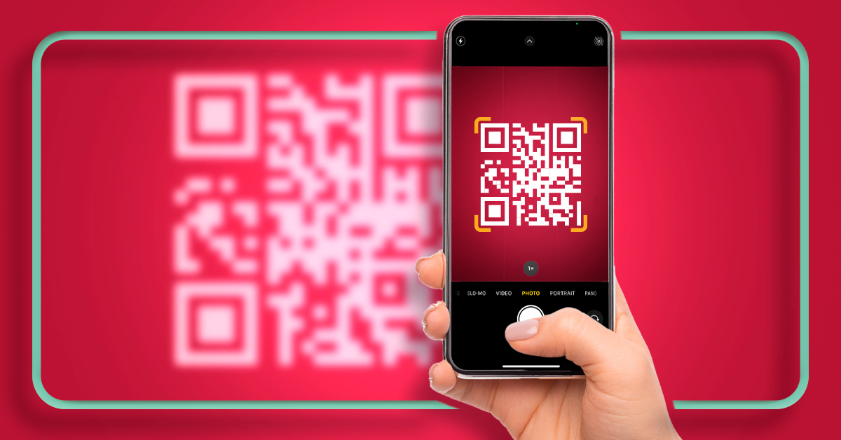
In 2014, I wrote a blog that advised against using QR codes for business until they became native in everyone’s phone camera apps. In 2017, we published an updated blog about the anticipated rollout of the native function in iOs 11 and hopefully Android shortly after that.
Fast forward to 2022. Those little black and white squares are everywhere and you can scan them with any camera app except your uncle’s flip phone. It’s how we view restaurant menus, learn more at a display, order food, pull up instructions on assembling the world’s most non-intuitive shelving or pay our friends for half of the tab.
Now that we’re all doing it, it’s time for a QR Code refresher on best practices and how to get the most out of this tool.
Best Practice (Cardinal Rule) #1:
The QR code MUST go to a mobile-friendly site.
We could also call this “Jen’s #1 pet peeve.” Have you ever scanned a QR code at a restaurant, and it took you to a PDF of their menu? Worse yet—a low contrast, hard-to-read, multiple column document? In italics?There are many low-cost or no-cost ways to build out a mobile-friendly page. Don’t make patrons pinch and zoom in to read your menu or information. In 2022 we should all assume “mobile-first” and build responsive websites anyway.
Best Practice #2:
The QR should send people EXACTLY where they expect to go.
If the QR code says MENU, don’t send them to your home page and make them look for it. If it is for assembly directions, send them to the directions page (NOTE: not a PDF!). It’s fine if there are other things they can or should do after visiting the page, but eliminate friction and frustration by giving the user the information they seek easily, with one scan.
Best Practice #3:
The QR code needs to be SCANNABLE and visible.
Technically a QR code should be a minimum of 2cm x 2cm. But if you want people to see it and easily scan it, make it larger and more visible. A QR Code is simply data, so the longer your URL (more data), the denser the code will be, which makes it harder to scan—especially at small sizes.
Make sure you print the code on something that won’t blur or get wet and distorted, providing contrast between colors. (Note—don’t invert the colors!) You can place your logo in the center of some codes without a special generator, test the scan and then test it again. And maybe 5 or 6 more times after that.
Now that we’ve got the most important rules of QR Codes down, here are some things you can do to make it a better experience and a more valuable tool.
Know the difference between static and dynamic codes.
A static code is a code that, once generated and printed, will always go to the same place. You can always create these for free.
A dynamic code allows you to edit the link and redirect it to your chosen site. This is helpful if you need flexibility in where the code takes the user. It can be useful for things like signage at events, a link to a video that may be updated or replaced at a later date, or on more permanent signage.
Don’t fall for a QR code tracking scam.
You can create a QR Code for free that will not expire, can be static or dynamic, and you don’t have to pay to know how many times it is scanned. But read the fine print first.
Many QR Code generator programs want you to pay for a service to get more options, to view tracking, or to keep your code active. Some will allow you to create a link for free, but only after signing up for a trial period. There are some nice options on the paid versions of some generators, but it’s not truly necessary to keep your link active. In fact, you can easily create one from a Chrome browser by visiting the link you’d like to generate a code for, clicking the share/send icon on or to the right of the address bar and choosing “Create QR Code.”
Think about what the viewer needs to do before using a QR Code.
Don’t use a QR Code to share the information if it is difficult or nearly impossible to complete the task on a cell phone. Use a simple URL or even a URL shortener to share the information so it can be opened easily on a desktop device. This should go without saying, yet I have seen it happen—don’t send a QR code in a text or email (unless it’s something they will need to have scanned to enter an event). Just send the link.
Test and test again.
Always test your QR code before sharing it. Try it with different types of phones and in low and bright light. Once the code is printed, be sure to check in once in a while to be sure your link is active and what the end-user expects.
And one last tip before you start generating codes for all your business needs: please don’t put QR codes on billboards.
Don’t Sit on Your Crazy Ideas
Got a brilliant idea for connecting with customers but need support to get it off the ground? Maybe you have a goal in mind, but you lack the creative to make it happen. Either way, de Novo can help.
Our expert Strategists, Copywriters, Designers and Creatives know how to make you stand out in a crowded marketplace. Reach out, and let’s meet over coffee (or a cup of matcha, if that’s your thing).
In the meantime, keep your brain in get-it-done mode with more blogs from our CEO, Jen Neumann:
Apple Just Called Bluff on “Email Open Rates”
How Great Brands Lead with Mission & Values


