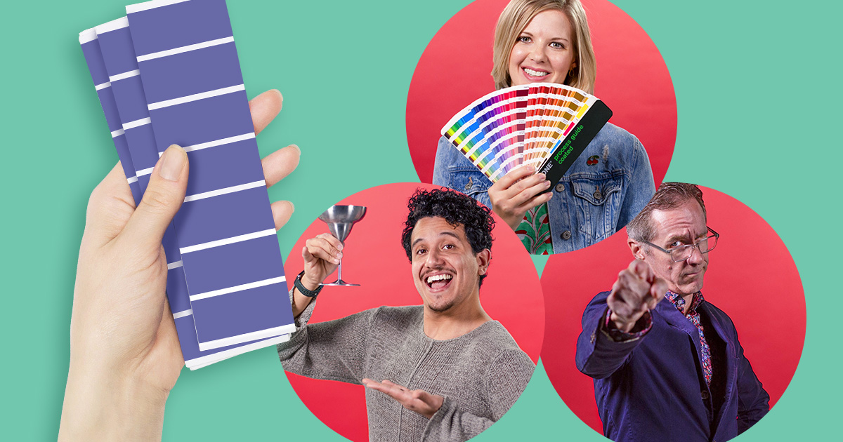
It’s the annual tradition advertisers have been waiting for: the unveiling of the Pantone Color of the Year.
For 20+ years, Pantone’s Color of the Year has set the tone for artists and designers everywhere. To select the color, experts from the Pantone Color Institute take a deep dive into emerging trends in fashion, art, interior design, entertainment, product packaging and more. The chosen hue is a sort of sneak peak into the next year in design—a forecast of the world’s collective artistic energy.
We asked our designers to weigh in on this year’s Pantone Color of the Year, Very Peri.
Here’s what they had to say:
Chris Moore

“I’ll be the first to say that I love a Periwinkle. It’s not a color we see much in the color palette of our life. I think this is because the more saturated tones of Periwinkle can’t be replicated in a CMYK (print) color space. That sucks for us. But as more of our lives are spent looking at some sort of electronic screen, Periwinkle tones should make a comeback. (That’s more of my opinion on how I feel about the color, than a prediction on the future of Periwinkle.)
As Periwinkle is a mixture of purple and blue, industries that predominantly use blue to market their brands—Insurance, Medical and Tech—should look to adding purple into their blue color palettes. This would break them out of the crowd of competition and let them promote a more progressive and active tone.
As for Pantone’s Very Peri, while I wish it had fell a little bit more on the purple side, is a great choice for the upcoming year. And I hope it provides the push Perriwinkle needs to make it back into the color palette of our lives.”
Becca Skalsky

In a world of chaos and uncertainty that has wreaked havoc the globe for nearly two years, I truly appreciate the playful, lighthearted qualities of PANTONE’s 2022 Color of the Year, Very Peri. It’s one of those shades that teeters on both the blue and purple spectrums depending on usage, or as I like to say, “blurple.”
Creatively speaking, I find myself gravitating toward blue in a lot of design work because of its flexibility across so many applications and industries. I suspect Very Peri will be no exception to that rule, as it offers a unique twist, combining the calm and stable attributes of a traditional blue hue while infusing it with the imaginative and inspirational qualities associated with purple.
May creativity and imagination reign supreme in 2022!”
Jav Ducker

“Is it violet? Is it blue? Is it both?! All I know is that it is fabulous! I’m very excited about Periwinkle being Pantone’s Color of the Year. As I write this, my brain is simultaneously creating combinations of Very Peri and other colors, since it’s one of those that can go with pretty much anything. Think of the beloved scarer with a heart of gold, Sully, and his iconic teal fur with periwinkle polka dots. (Any Pixar fans reading this?)
Periwinkle is a color with a lot of versatility that, oddly enough, we don’t see all that often in the design world. That could be because its characteristic “vividness” might be hard to replicate in print, but with the emphasis shifting more to digital mediums in recent years, I am hopeful that it will get the attention it deserves. I myself am looking forward to incorporating this playful yet soothing color into more of my designs—and my life.”
Curious how colors can impact a logo—or an organization’s overall brand? Head to our portfolio page to see some of the visual brands we’ve created for clients.


