As volunteer and audiences change, non-profits must change their approach to attract and retain new audiences.
Many existing non-profits are facing a crisis. As their core audience and volunteer base ages, new audiences may not be backfilling at a rate that makes the organization’s mission sustainable in the long run.
It’s a perennial question, but one that even more museums, libraries and destinations are facing. How can we attract GenX and Millennial audiences, while not alienating our older patrons?
In this blog post, we’ll talk about a few of the tools that will help set your organization up for success and help you think about how to target communications effectively on the right platforms to the right audiences. In this blog post, we are specifically addressing web presence, as it is the first point of entry for almost all audiences, but certainly newer and younger potential patrons.
YOUR WEBSITE MATTERS
First and foremost, your website is the equivalent of what used to be a brochure at the Visitor’s Bureau. While a brochure can still matter, your website is your number one communication tool. This is how you bring the experience of your mission to life – critical for younger audiences, who seek experiences over material items, but effective across all generations.
A modern, effective website employs the following elements:
It’s Mobile Friendly
- Not only is it mobile-friendly, it takes the mobile users’ motives in mind. With mobile usage increasing rapidly, you must assume that your viewer will view your site on a device. When viewing from a device, you must ensure that contact and directions are very easily found, and then make your visual appeal something that works on a mobile device.
It’s Visually Appealing:
- You could make the argument that this has always been the case, but often the aesthetics of the site are overlooked as headers and sliders get changed to reflect the day to day needs of the organization, and not the over aching strategy. Consider your slider image your one chance to grab the attention of the visitor. Is it your best foot forward?
- Regardless of generation viewer, a powerfully built slider image can captivate a visitor. The best image designs are simple, have a click to follow call to action and give the viewer enough time to consume the info and make a decision.
- Non-profits are generally rich with content – but have not invested in imagery or copy that supports it. Find time and budget to focus on this and choose your best, most powerful stories and assets to showcase.
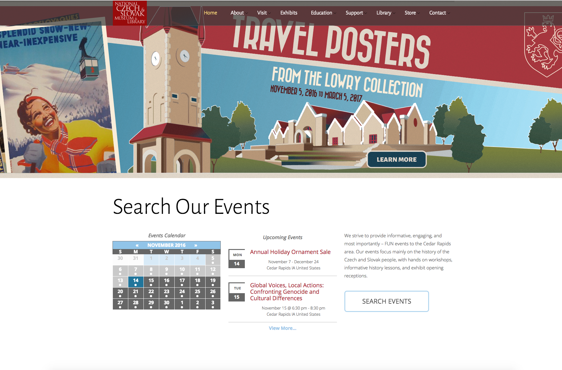
- Consider whether static or rotating sliders are right for your website. Some organizations use the slider as a way to cut clutter, or to appease different departments. A small (1-3 sliders) number keeps the user focused on your site content without confusing them. Video within slides is also a really popular choice right now, as is parallax design and animated, dynamic content. What ever your strategy, keep it as simple as possible. Below, is a screenshot from the National Czech & Slovak Museum & Library, using strong imagery with a simple call to action to highlight a current exhibit.

It Meets your Viewers Needs:
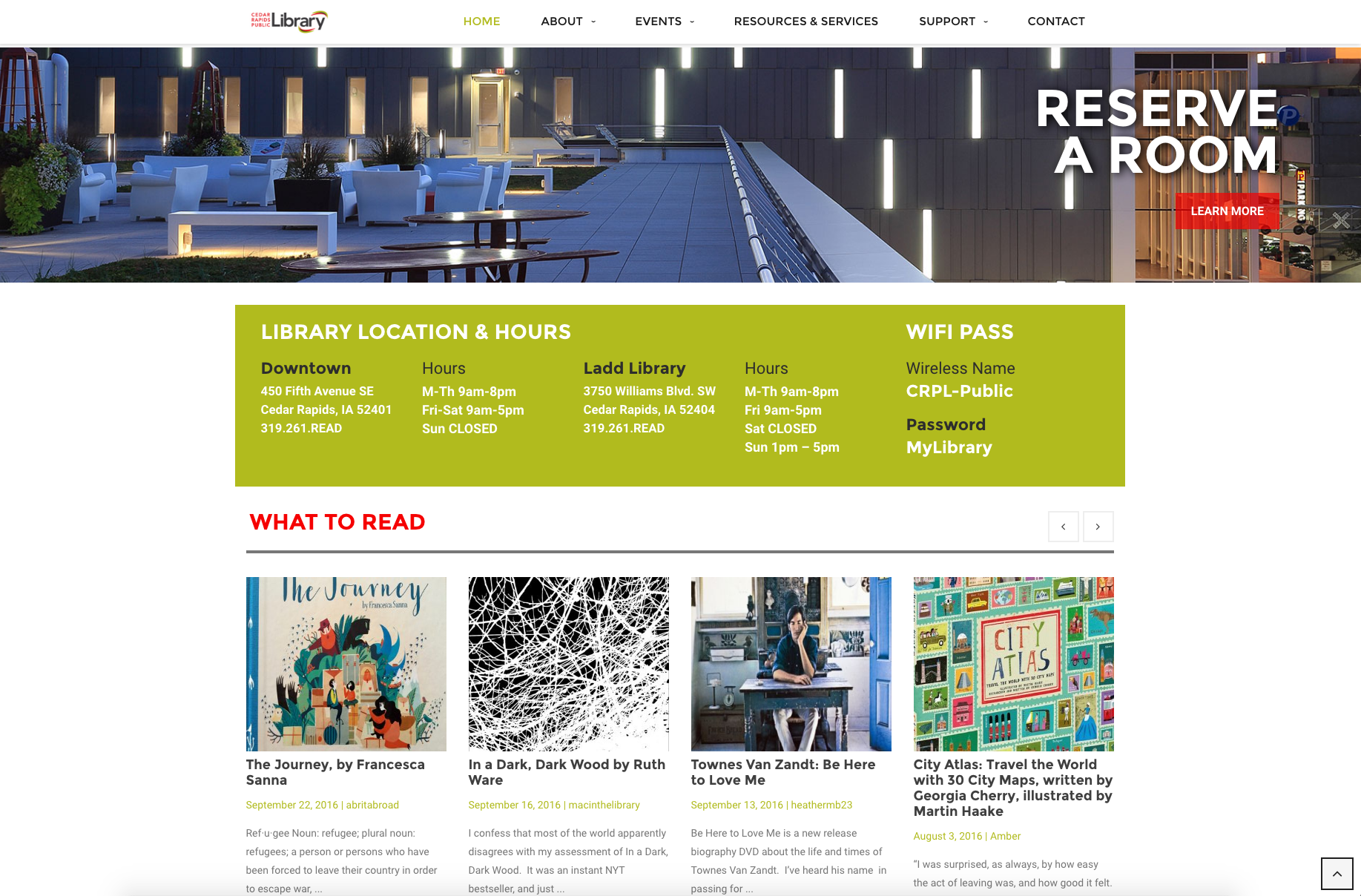
- Take a look at your analytics and determine what people are searching for when they come to your site. It might not jive with your mission, but it will give you the insight you need to put the viewer’s needs first. Do they come to your site most for directions? For schedules? Make sure that is easy to find. Below you will see a screen shot from the Cedar Rapids Public Library. They recognize that the spaces available for rent at the facility are both an important business goal and drive traffic to their site. They also make it easy to find the public WiFi password and locations on the home page.

A COMMON PITFALL
One of the most common errors non-profits make is to cram all the business needs into the front page or top navigation of a menu. Departments feel they must compete for “air time” and to meet this demand, marketing department often feel they must add more and more to the website to satisfy the demand. This results in too many slider images, a top heavy navigation that is confusing, and too much mission and not enough enticement on the home page.
To be clear, the modern viewer isn’t there to read your mission, vision and values statement, view your Board of Directors or any of your documentation. They are visiting because they have heard about a program, they are looking for an experience, or they are curious about your offerings. Keep the motivation central to the main elements of the site and keep non-marketing elements where they belong, at a sub-menu level. (And develop a thick skin, because there will be internal complaints.)
A great site – for a non-profit OR a for-profit business, keeps the viewers needs and desires in mind, while balancing it with the business goals. A site that comes off as either pushy, salesy or does not give the consumer what they want easily is the same thing as an aggressive salesperson trying to sell you something you don’t want or need.
NOW WHAT?
Take a hard look at your website. Ask your audience to do the same. Does it meet their needs and their goals? Is it your best possible first impression to the new visitor? This is also a good time to take a look at your Google Analytics and gain insight to your visitors real motives, as well as develop benchmarks for increased viewership.
Need help assessing your site? Contact us and we’ll help you build a plan to attract new audiences by highlighting the great work you do in your community.
{{cta(‘e6ce2465-8e31-43d6-afba-896120493c0d’)}}


