Fresh Thinking
""
""
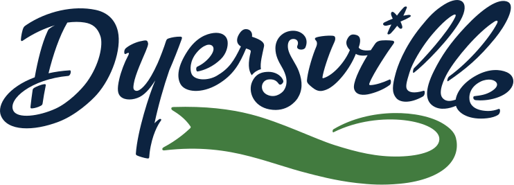
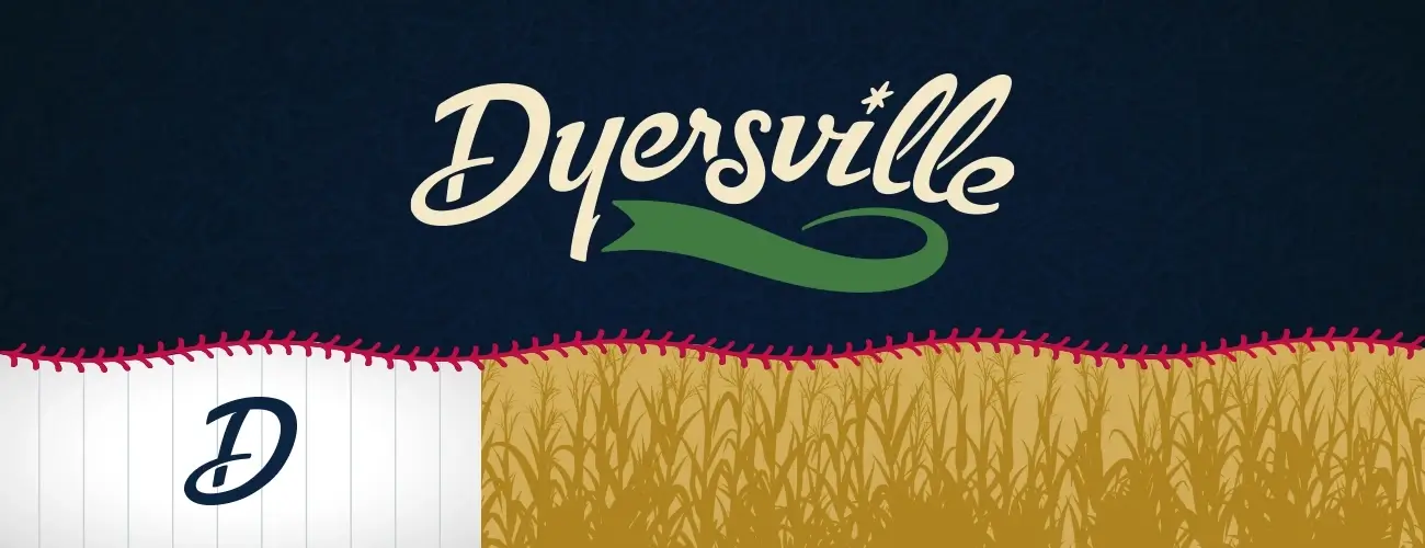
Dyersville logo featuring stylized text with a green swoosh and a corn field illustration below

City of Dyersville

Every community has a little magic. In the case of Dyersville, Iowa, there’s A LOT of magic. See how we gave voice to it all.

Uncover & Understand

Think of Dyersville and most people’s minds go to the Field of Dreams. The movie site draws people from across the country (and even around the world) to experience baseball surrounded by cornfields. But there’s so much more to this Iowa town. To attract new people and reignite the pride of current residents, Dyersville enlisted us to highlight what makes the community far more than a one-hit wonder. We turned to our Strategic Insights process.

Before

City of Dyersville logo

After

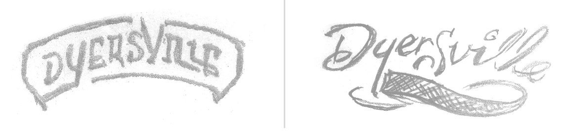
Two logo sketches for Dyersville, featuring stylized text and decorative elements

Ideate & Implement

Messaging

After evaluating Dyersville’s audience, competitors, and existing brand, we discovered an insight that drove our branding and messaging:

The magic wasn’t confined to the Field of Dreams; it was everywhere you looked. Baseball, farming, and main street meet to make Dyersville quintessentially American.

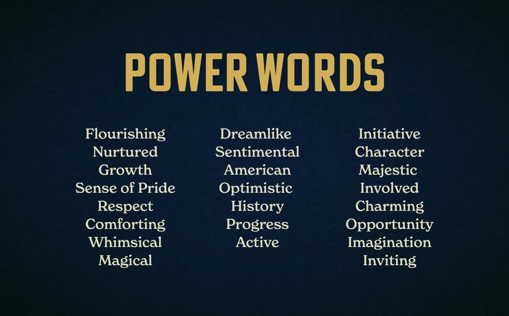
We took that sentiment and applied it to their new logo, power words, and supporting messaging. Not every community can use words like “whimsical,” “majestic,” and “dreamlike.” For Dyersville, they all fit. Those words drove every piece of writing and even provided inspiration for the logo design and video work.

Three columns of power words organized by category: Flourishing (Nurtured, Growth, Sense of Pride, Respect, Comforting, Whimsical, Magical), Dreamlike (Sentimental, American, Optimistic, History, Progress, Active), and Initiative (Character, Majestic, Involved, Charming, Opportunity, Imagination, Inviting)

We subsequently segmented our messaging based on three audiences:

  • Lifelong Residents
  • Boomerangs
  • Prospective Residents

This allowed Dyersville to tailor specific points to people based on whether they knew Dyersville like the back of their hand, had lived in Dyersville and moved away, or had never heard of Dyersville in their life.

Logo Development

Magical messaging needs a logo that strikes the same tone. We redesigned the city’s logo to convey a sense of American whimsy. A new script font, strong colors, a pennant inspired by baseball and the rolling hills surrounding Dyersville, and a twinkle element to emphasize the feeling of wonder.

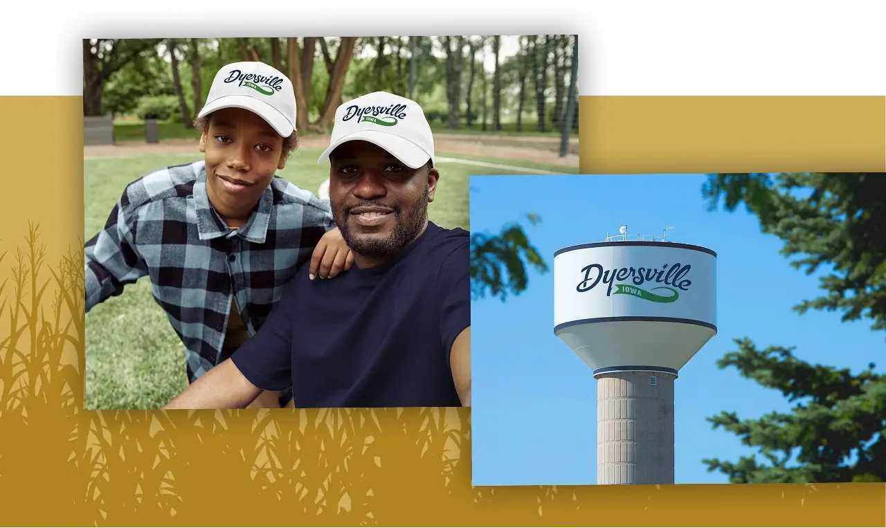
Man and child wearing Dyersville caps smile together in a park, representing community connection for a full-service marketing agency

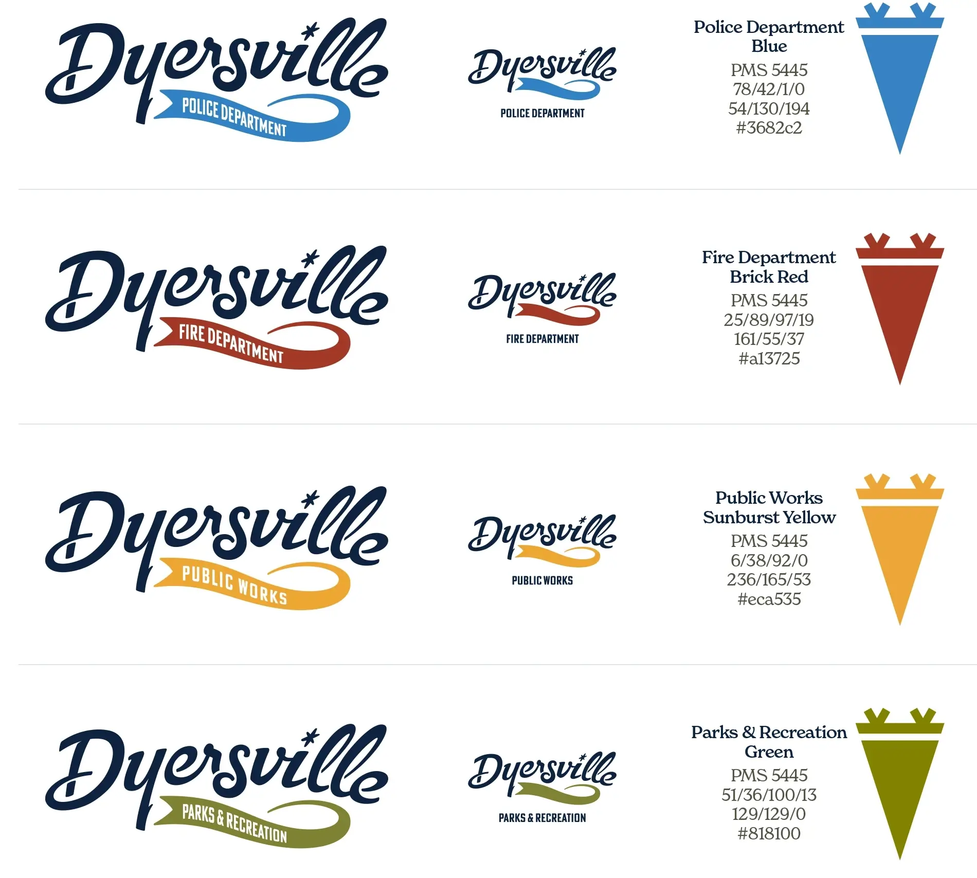
A brand’s only as good as how you use it. Along with the logo, we created an entire brand system complete with a full color palette, different colors for different city departments, and suggestions for how the brand could be used on merchandise and signage. This gave city leaders what they needed to roll out the brand when they were ready.

Dyersville city department branding guidelines showing logo variations and color specifications for Police Department (blue), Fire Department (brick red), Public Works (sunburst yellow), and Parks & Recreation (green)

Refine & Refresh

2026 is a big year for Dyersville. They’re a stop on Iowa’s famous RAGBRAI bicycle ride. They’re set to host a second annual music festival that draws people from around the region. And Major League Baseball returns to the Field of Dreams for a game under the lights. Our branding work—already featured on the city’s website—could pop up at each of those events, helping people discover that when it comes to Dyersville, the magic’s all around them.

The Refreshingly Meaningful Part

Tapping into the magic of one of Iowa’s best communities to let everyone know that the dream continues far beyond the field.