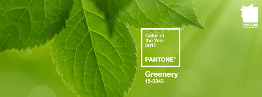
The 2017 Pantone Color of the Year is Finally Here
(And Despite the Snow, Things Are Still Looking Green)
 Every December, Pantone releases their Color of the Year. It’s an eagerly anticipated moment for anyone in design-related industries, and de Novo is no exception. But why exactly is that?
For artists, designers, advertisers and many other professions, Pantone is basically the Pope of color. It sets the standards that allow designers to match colors in print materials, and it has a massive amount of influence on color trends in art, fashion, interior design, and marketing. It’s thanks in part to Pantone that the red on the can of Coke you’re sipping matches the red on the box it came in. Pretty cool stuff.
This year, Pantone chose Greenery, a lively shade of green that brings to mind a cool glass of limeade, freshly cut grass, and all the best parts about summer. It also seems fitting that they should chose this particular shade, as eco-friendly consumerism and “going green” have risen to the top of public consciousness in recent years.
So what do actual designers have to say about Greenery? We asked de Novians Chris and Becca for their take on the 2017 Color of the Year:
Chris Moore, Art Director
Greenery… OK, before I even read the announcement I wondered if this is Pantone’s way of commenting on the social and political uncertainty of the day. And that is exactly what they’ve done. Let me be the first one to say that I am proud of them. We need these types of affirmations to tell us that things will indeed be alright.
Pantone’s decision to lead with positivity and brightness, flying in the face of the darker parts of our current political shifts is to be commended, if not fully praised. Now, being the eternal pragmatist, I wish that Pantone would have gone a little brighter. But considering the last two Colors of the Year have been downright laughable, I won’t complain.
May positivity and common sense prevail. All hail to Greenery.
Becca Skalsky, Graphic Designer
We’ve reached that time of year. 2016 is drawing to a close and, naturally, the approach of the New Year brings with it the promise of new beginnings and a fresh start. And not a moment too soon for some, given the divisive state of our country.
Aesthetically, I find myself drawn to this particular hue because of its calming quality and versatility within the realm of art and design. And, as a graphic designer who is constantly behind a computer, it provides a small connection to nature and the outside world. Or perhaps it’s just my own personal way of coping with my aversion to winter and cold, and serves as a subtle reminder that warmer spring months aren’t too far off.
Either way, it seems only appropriate that the Color of the Year, Greenery, offers the same sense of hope and positivity that so many of us are craving. Nicely played, PANTONE. Nicely played.
What do you think about Pantone’s new Color of the Year? Tell us in the comments below.
Now for some shameless self-promotion: Like this blog? We like you, too! Subscribe on the right-hand side of the page and we’ll send you more articles like this straight to your inbox. It’s an easy way to keep tabs on all the crazy things that affect the world of marketing. (It’s also work-related entertainment you don’t have to hide from the boss.)


