Our Approach
Our focus was to develop an overarching concept and messaging that helped raise awareness of the new branding while maintaining continuity.
Having worked with Simply Organic for a couple years, we used our familiarity with the company’s mission and values to inform our decisions. This historical knowledge and strong relationship were important for ensuring a smooth, streamlined transition to the new branding.
We also went outside our internal knowledge to get a sense of the broader cooking culture connected to organic seasonings and kitchen organization.
From that research, we discovered a trend of order and stability, focused on organizational detail—arranging objects by color, size, and different categories to create a sense of order and calm.
We combined both our historical brand knowledge and new research to create a wholly original campaign theme, tagline, and supporting messaging.
The Work
We started with a campaign theme (Organic Looks Good in Your Kitchen) and tagline (New Look, Same Organic Goodness).
The theme spoke to people’s need for organization and the sense of calm and satisfaction that come from simplicity and alignment. The campaign introduced the public to rebranded Simply Organic products while highlighting how the brand brings a sense of stability and Zen to the kitchen.
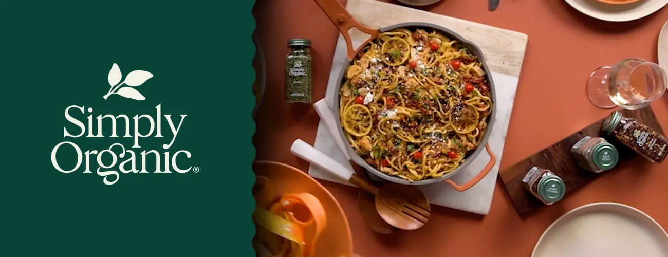
Corresponding visuals highlighted Simply Organic products around the kitchen—in cabinets, drawers, spice racks, and intentional arrangements—helping consumers to envision themselves happily using these products at home.
For deliverables, we developed copy for emails, social posts, landing pages, and a video concept as part of a comprehensive rollout strategy.
Our work prepped consumers for the change, built awareness, and established consistency. Throughout the process, we stayed true to Simply Organic’s identity, emphasizing that they were providing the same always organic, always responsibly sourced goodness people knew and loved — now in a fresh, new design.


